What is Google’s Mobile-First Indexing?
Research shows that as of 2019, 63% of search traffic from the US came from mobile devices. That only means that mobile is here to stay. Therefore, businesses should give preference to their website’s mobile version because Google recognizes this with mobile-first indexing. Although it sounds complicated, it quite simple to grasp. Thankfully, herein is everything you need to know about it.
According to Google, mobile-first indexing denotes that Google mainly leverages the mobile version of the content for both indexing and ranking. Previously, Googlebot predominantly used a site’s desktop version to establish a webpage’s significance to a search query, but that has moved to mobile variants. That is not a problem for most businesses because the responsive version of the desktop site is served to mobile users without any changes. However, there would be an issue if a website served varying desktop and mobile versions.
If your business is one of the few clinging to desktop websites, it is time to make your site mobile-friendly. Otherwise, you will see a negative effect on your search rankings for your desktop and mobile searches. It is named mobile-first because if your website does not have a mobile version, Google will still include the desktop version in the index. However, the absence of a mobile-friendly experience negatively affects your ranking.
Even if you think that you should not worry, understanding mobile-first indexing is still crucial as it will help you now and in the future. Research done in 2019 showed that only 13% of sites could maintain the same rank across devices. That shows how important it is to get your website’s mobile experience and search engine responsiveness right.
In a simplified mobile-first indexing approach, Google algorithms use content from your website’s mobile version for rating your webpages on Search Engine Results Pages (SERPs).
Are you up to date with Google’s Mobile-First indexing?
Mobile-first indexing has been on Google’s work plan for several years. The feature is meant to make the ranking of websites fast and easier.
In 2016, Google announced to shift to mobile-first indexing, and since then, they have been gradually rolling it out to websites. By March 2021, Google plans to have moved all sites to mobile-first indexing. Here is the chronological order of events.
- November 2016 – The announcement of Mobile-first indexing and testing on some websites
- March 2018 – Mobile-first indexing rollout.
- July 2019 – Mobile-first indexing made compulsory for new sites
- March 2020 – More than 70% of crawled websites currently on mobile-first indexing. Google also announced that by September 2020, 100% of websites would be on mobile-first indexing.
- July 2020 – Covid-19 pandemic interrupts 100% mobile-first indexing and shifts it to
- March 2021 – Tentative launch of mobile-first indexing for all websites
How do you know that you are on Google mobile indexing?
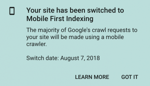
Most of the websites have switched to mobile-first indexing, but it will take some time until Google analyses and ranks your site’s mobile version. If you are presently on mobile-first indexing, you have probably received a Google Console notification informing you of this, as in the following screenshot.
If you have not received the notification or want to make sure that you are on mobile-first indexing, here is an easy way of checking.
Go to Search Console and do a URL inspection for your website pages by pasting your URL into the text box located at the top of the screen.

You will shortly view the coverage results of the URL

For the above example, note that the URL has crawled as ‘Google smartphone.’ That is a quick way to know how Google crawls your website and, in this instance, mobile-first.
How do you prepare for Google’s Mobile-First indexing?
If your website is not ready for mobile-first indexing, you need to prepare your site in the following ways.
Ensure that Googlebot sees your content
In mobile-first indexing, Google gets information from your website’s mobile version. Therefore, ascertain that Googlebot can view your entire content and resources there. To achieve this, consider the following.
Lazy-loading on the mobile version
Lazy-loading is common for videos and images and is a common issue on mobile than desktop. Specifically, avoid lazy-loading your main content based on user interaction such as typing, clicking, and swiping. That is because Googlebot will not prompt these interactions.
For instance, if a page in your desktop version has ten primary images and the mobile version has two, the remaining eight images are loaded from the server when the user clicks the add (+) button.
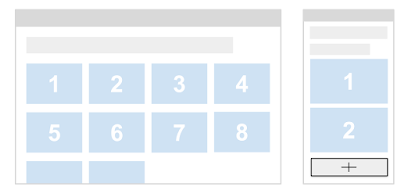
In this example, Googlebot will not click add button to load the remaining eight images, and it will not see them. Therefore, they will not be indexed or displayed in Google images.
The robots meta tags on the mobile version
You need to use similar robots meta tags on your desktop versions as those on your mobile version. If you use a different one, such as no-follow or no-index, on the mobile version, Google might not be able to index your page or follow links once your website is mobile-first indexing enabled.
Understand what you block
The URLs of some content and resources on the desktop version differ from those in the mobile version as they sometimes have different hosts. For Google to crawl your URLs, ensure that your robots.txt file is not blocking the crawling. For instance, disallowing URLs of images results in the images disappearing from Google Images. Also, blocking .css files URLs hinders Google from portraying your pages accordingly, and that might interfere with your page rankings in Search.
Look into your videos and images.
The images and videos on the mobile version need to follow the best practices. You need to check the following.
Quality of the images
Avoid using low resolution or too tiny images on your site’s mobile version. That is because extremely small and poor-quality images may not be chosen for insertion in Google Images or displayed correctly if indexed.
For instance, assume that your page on the desktop version contains ten main high-quality images. A poor practice on the mobile version would be to use tiny thumbnails to fit on a smaller screen.
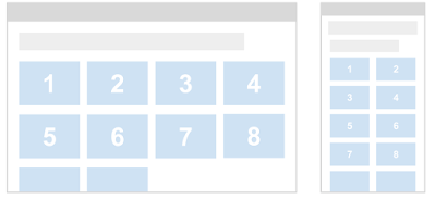
Desktop version and mobile version with small thumbnails
Google might consider these thumbnails as low quality as they are too tiny with low resolution.
Varying image URLs between the mobile and desktop versions
If your website uses various image URLs for the mobile and desktop version, you will likely experience traffic loss from Google temporarily as your site shifts to mobile-first indexing. That is because the mobile version URLs are new to Google’s indexing system, and it takes time to understand the URLs correctly. To avoid transitory traffic loss, consider retaining the same image URLs used by the desktop.
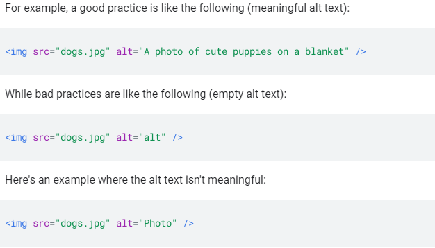
Alt attributes for images
The use of unimportant alt attributes may affect the appearance of your images on Google images negatively.
Video markup
If you use schema.org’s VideoObject structured data on your desktop version, your mobile version should include VideoObject containing the same information. If not so, Google indexing systems might encounter challenges when trying to get sufficient information about your videos. Hence, they might not be visible in Search.
Image and video placement
Make certain that your images and videos’ positioning is precise and in an easily accessible location on your page’s mobile version. If the images and videos are misplaced, that could negatively affect the user experience, and Google would not show their Search visibility.
Check your ad placement.
Ads can negatively influence your mobile page rankings if you are not keen on their placement. When you want to view ads on a mobile device, follow the Better Ads Standard and ensure that they meet the criteria.
Keep important content
Typically, there is a difference between how a website appears on desktop or mobile. It is more difficult to display everything from a desktop to a mobile site due to smaller screen sizes. Space is inadequate for mega-menus or sidebars, and mobile sites hide or exclude some of the content on desktop sites.
Your desktop website’s content does not have to be a duplicate of the desktop content. However, all the important content must be available on mobile. Leaving out things like email opt-ins is not a big deal from an SEO perspective. However, deliberately leaving out things because they are too long on mobile can impact your site negatively.
In the past, invisible content on mobile was considered less than visible. Google’s Mobile-first indexing changed this. Today, there are more design options, such as tabbed content, and Google no longer overlooks hidden content to improve user experience.
Links
You need to check the links as well. Your main focus should be on internal links because you want to ascertain that all critical links exist in the mobile version. You probably need not worry about external links to your website. They should merge correctly and be counted as part of your mobile pages on the condition that the canonical tags are accurate.
Google’s Mobile-first Indexing Best Practices
Some aspects of Google’s algorithms are complicated and not known to many. Luckily, Google provides advice to help SEOs and webmasters thoroughly understand mobile-first indexing. The mobile-first indexing best practices guide is available to help users have the best experiences. It is an excellent reference point, especially for marketers that want to understand mobile-first indexing. The guide emphasizes the following.
- Ensuring that Googlebot has access to your content and can translate it
- Ensuring that the content in the mobile and desktop is the same
- Examining your structured data
- Placing similar metadata on the desktop and mobile versions of your website
- Examining the placement of your ads
- Examining visual content
- Identifying mobile-first issues
- Additional best practices for distinct URL
You need to find time to read the guide and refer back to it if you encounter problems that stem from your mobile website or moving to mobile-friendly.
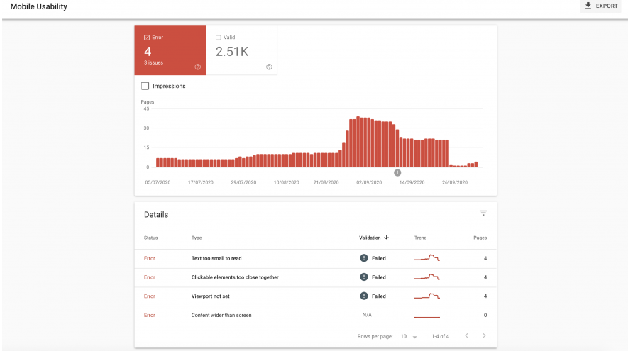
Test your website’s mobile-friendliness
You can test your site’s mobile-friendliness using Google’s mobile-friendly test platform. It is as easy as entering a web page URL and point out any mobile-usability problems that exist. Keep in mind that mobile-first indexing and mobile-usability are not the same. Nonetheless, it is crucial to establish how Google crawls your mobile versions.
In the above example, you can see that the page hacks the mobile-friendly test, but several loading problems might require further examination.
The major issue to focus on is blocked resources. According to Google, blocking an important resource could affect how Google translates the page. For instance, a blocked CSS file could cause the wrong font styles to be used (for instance, too small or too big for a device). A blocked big image could also give the idea that a page is mobile-friendly while it is not. That affects Google’s crawling ability to your page and your mobile usability score. Therefore, make certain that robots.txt does not block Googlebot from accessing crucial resources.
Another way of analyzing your website’s mobile usability is through Search Console. You need to go to the next tab in the ‘enhancements’ menu to see the errors or issues that need your attention.
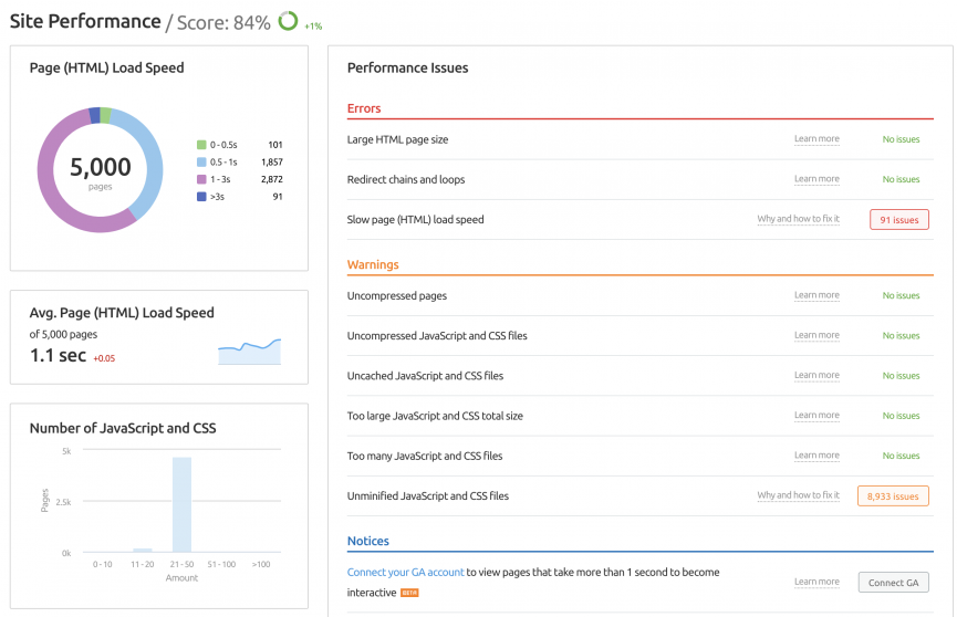
Check the page speed
Page speed is extremely crucial as nobody is interested in browsing a slow web page. Users always prefer faster sites making the speed of a site an essential ranking factor. Page speed is integrated with Google’s mobile-first indexing, and slow page speed demotes your ranking. Hence, ensure that your page’s loading speed is fast to boost the ranking potential. Likewise, ensure you optimize your pages not only for search engines but also for users.
Also, slow page speed negatively impacts the bounce and conversion rates, and the duration users spend on your website. Delaying on improving your page speed can harm different areas, and you need to act fast.
SEMrush’s Site Audit tool is excellent for investigating your website’s speed and generating the site performance report. The following is a sample report.
Conclusion
If you have not shifted to Google’s mobile-first indexing, it is time to do so. You need to prepare your website accordingly because making your website mobile-friendly is one of the Google ranking factors. Note that you will be moved to mobile-first indexing come March 2021. Therefore, the earlier you make the preparations, the better.
When did Google start mobile-first indexing?
Google rolled out the update on July 2019 for all new websites. However, the full rollout was pushed to march 2021 due to the Covid-19 pandemic.
What is the mobile-first index?
It basically means the mobile version of your website becomes the starting point for what Google includes in their index and the baseline for how they determine rankings. This means that all websites should be mobile optimized.
How long before my site is indexed by Google?
It takes between 4 days and 4 weeks before all your content on your website is crawled.
What is mobile-friendly SEO?
This refers to optimizing your website so that the site looks great and functions properly on a mobile device.